Posted on in Storie
Sometimes, we choose symbols because they represent us. Other times, the symbols choose us. They suggest to us, through some not-quite-logical alchemy, something about our identities that we were looking for in that very moment.
The graphic and symbolic power of the Bruno Rocca quill is a story of this last type. It was a bit like falling in love, when we first try to win the object of our love and “frame” him or her within our lives, but soon that very person dictates the rules of our being, of who we are and who we would like to become. We recognize more about this person, almost, than we do in ourselves.
How did the quill begin? To respond to this question, we have to start with the basics.
For our winery, 1978 was a turning point. After almost a century of working as vine growers in Barbaresco, thanks to papà Bruno, the Rocca family began to bottle wine under the family name. The period between the 1970s and 1980s was a whirlwind of experiments, innovations, enological conquests, and lengthy discussions between producers.
The producers who sold their grapes to the community wineries began to get their feet in the game. They painstakingly bought machines for winemaking, restructured their old wineries, and exchanged knowledge and technology among themselves. Above all, they began to be aware of the quality of their terroir.
Besides these practices that would transform the history of Piedmontese wine, however, many producers also searched for a symbol that would identify them in their new venture. Even our winery was on the hunt for one of these symbols, to create an essential label. Something that would show our way of making wine in a simple, sincere way. Something that spoke of our meticulous search of quality in everything, starting from what we have always held the closest and dearest to us: the vineyards.
At the time, Bruno was a friend of an extraordinary artist of Dogliani, an “earth illustrator” as he would later be called. His name was Gianni Gallo (1935-2011), a fine designer and printmaker as well as an agriculturalist, he was a person who thought outside the box, a “studious farmer.” He was rebellious, hospitable, always ready for a party, and as dynamic in his ideas as he was attentive in carrying out his work.
In 1981, Bruno spoke with Gianni Gallo about his quest for a symbol for his wine label that would be both simple and recognizable. Gianni sketched a first draft, but it was not what Bruno was expecting.
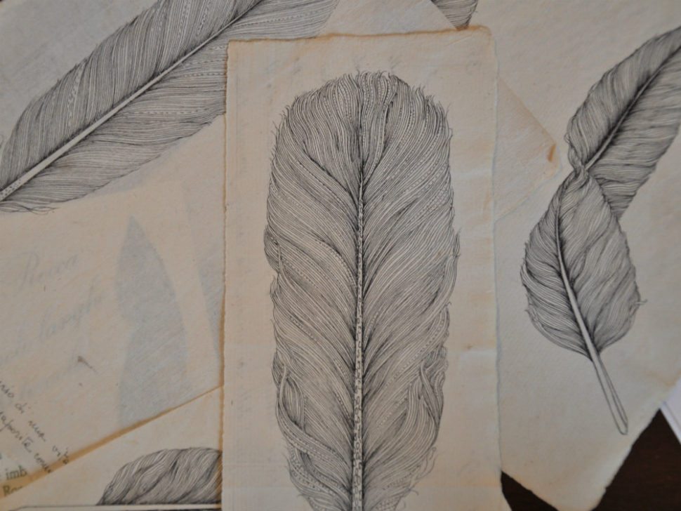
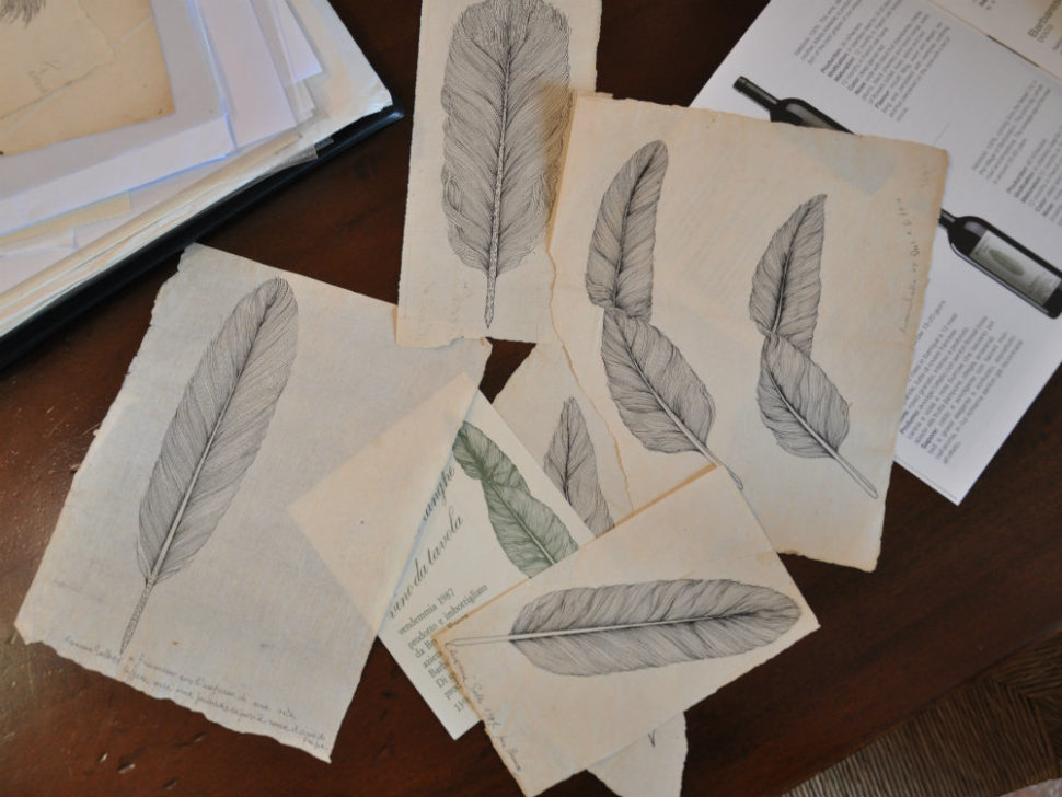
What was it? Gallo had drawn a quill. And not just any old feather, but a quill in white and black on old archive paper. Underneath, he wrote:
Leggero come una piuma, importante come la scrittura: “Light as a feather, as important as the written word.”
“The importance of the written word,” slowly, because our motto: a wine that knew how to “say” something, a wine that could “talk,” that could tell its inimitable story made of earth, of autumn fog, of muddy boots, of passing the day at harvest. A wine with an internal “grammar:” equilibrium, subtlety, elegance. A wine that never forgot its origins, but that always knew how to exalt them and carry them within it, like a signature.
Today, the quill, which Gianni Gallo continued to draw in various styles for Rabajà until 1994, is the symbol with which our wines write their adventures. Every wine has its quill.